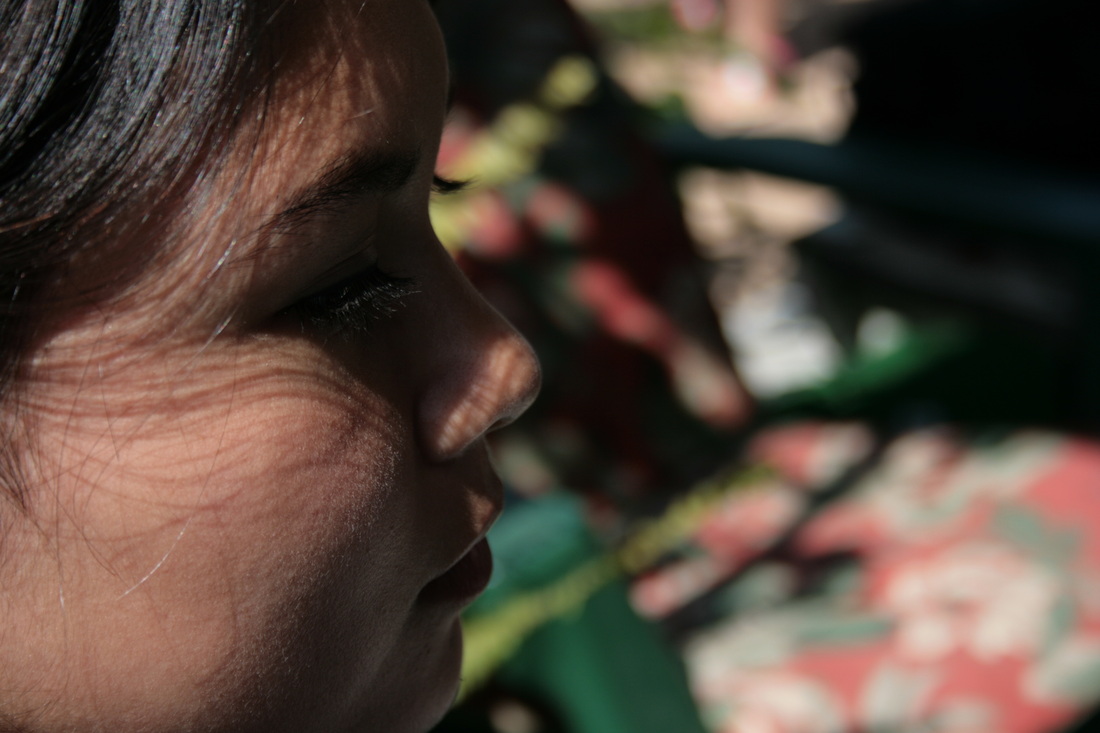
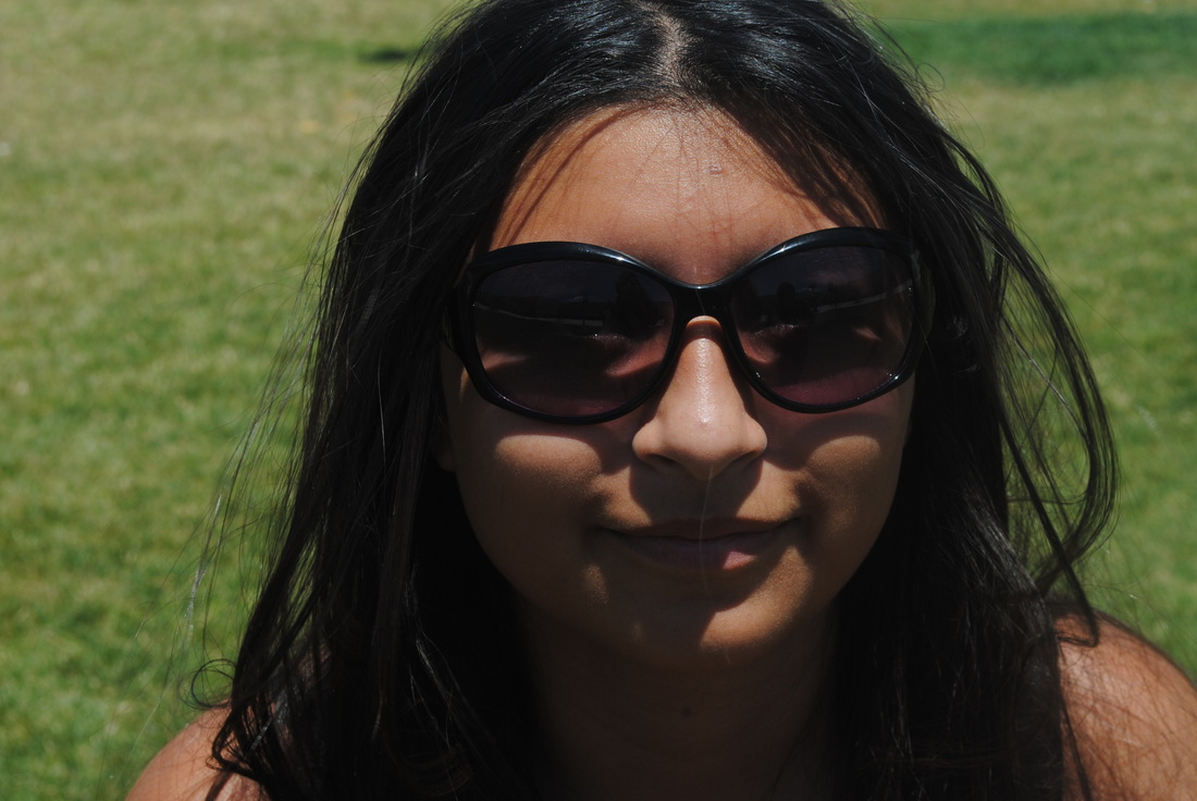
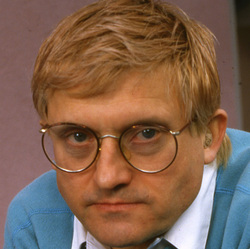
Biography
David Hockney began as a painter in Los Angeles. He loved their swimming pools, and focused mostly on them. He experimented with perspective, and liked the idea of trying to make a photo a bit more 3-dimensional. He came up with the idea of what are now called “joiners” when he took a retrospective photo as a reference for a commision. He was unsatisfied with the result, and ended up taking a series of photos and collaging them together to form a single. He realized that it was an art form by itself, and enjoyed the multiple perspectives enough to continue to make more of what he became famous for. In 1982 he moved to Los Angeles and started experimenting with the idea of cubism. He put multiple polaroids together to form a grid. He tried turn 2-d photography in 3-d by collaging, zooming in and out, and shooting from multiple slightly different angles. He painted more pools, and took polaroid collages of them. He also did joiners of someone swimming in a pool, which he surprising hadn’t done in all his photography and painting of pools.
He continued to paint and draw throughout his career, but with the addition of more joiners. In 1986, he accomplished what is probably his most difficult and impressive joiner; The Pearblossom Highway. It contains hundreds of individual photographs to create a 78 by 111 inch final product. In 1998, a stars a series of chairs inspired by Van Gogh and also takes one of his other more well known joiners of a chair that looks like its been bent in an atypical way.
Later, he creates a book using his first digital camera, and starts to use technology in his work more often. He paints tons of portraits using the computer. Later, when the iPhone comes out, he uses it to do more digital art of various things on the go.
Critiques
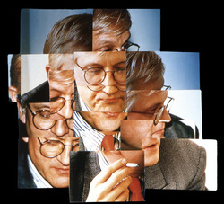
This self-portrait is a collage of Hockney smoking. He’s wearing round-framed glasses, a gray blazer, striped button-up, and a red tie. Most of the pictures are a bit over saturated and bright, but a few towards the top are darker as if some clouds had come in. I suspect he used flash to get this effect. He’s wearing a hearing aid of some sort in his right ear. He is presumed to be smoking, although the actual cigarette is only in one of the photos, where as at least parts of his face are in most every picture.
What I think Hockney was trying to convey in this picture was this part of his life that he maybe doesn’t like about himself. Smoking is pretty unhealthy, and he’s focusing more on his face in this collage. The cigarette is only in one picture, so the viewer is focused more on Hockney’s feelings shown on his face towards his habit. In some of the photos, he is looking down, indicating shamefulness. In others, he is looking away from the cigarette. Also, the pictures of his head are darker which indicate darker thoughts. Overall, he looks pretty unhappy. All this is directed toward the cigarette he is holding.
This is a combination of photos which of Hockney’s face and his cigarette. We are lead to look at and focus on the cigarette because of the placement of photos creating a line, and we see his eyes looking at it as well. There is also contrast between the top of the collage and the bottom due to the difference in saturation and brightness. The brightest photo is of the cigarette, again leading our eyes to look at it. There is repetition because of the repeated photos of his face. Variety is a big element as well with the different angles of his face, jacket, clothes, and the collection of separate photos altogether gives a sense of variety.
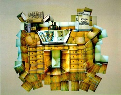
This collage is of a wooden desk. The way Hockney puts the photos together along with the use of lighting gives an extremely 2-dimensional look to the desk. On top of the desk, there are a couple of vases, a box labeled “Large Dog Biscuits”, a book or album of some sort, and a few stacked books. Also photographed is the wooden floor.
What I think Hockney was trying to accomplish in this image was a feeling of disorderliness. The desk itself might be fairly neat and clear, but the way he puts the tilted pictures together makes it look bulky and jagged.
I actually like the way the photos are organized. They make all the objects look more 2-dimensional, and maybe bigger than they normally would be. There is a good sense of balance/symmetry with the objects on the desk, and the drawers/desk itself. The saturation also gives it a cartoonish, unreal effect.
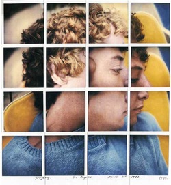
This collage consists of 16 Polaroids put side by side in a grid form to form a single picture. The pictures make up the profile of a Caucasian boy with brown, curly hair and brown eyes. He is sitting on a yellow chair and wearing a light blue sweater. Part of his hair is being lit by the sun, while the rest of him is in a bit of a shadow. His eyes are looking down in the photos of his face.
When at look at this photo, I see similarities to photo #1. He isn't looking at the camera, but down, and he looks as if he is ashamed of or by something. He looks very relaxed, and the colors in the photos give the viewer that feeling as well. The grid formed by the Polaroids also creates some separation and lines.
When at look at this photo, I see similarities to photo #1. He isn't looking at the camera, but down, and he looks as if he is ashamed of or by something. He looks very relaxed, and the colors in the photos give the viewer that feeling as well. The grid formed by the Polaroids also creates some separation and lines.
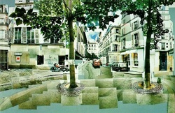
This piece is of a city. The colors seem washed out, and it has a sort of blue/green tint. The angel gives you a look into an alley way and the back of a building. There are two trees, and the way Hockney took the individual photos gives the illusion that some of the leaves are really large. There’s a motorcycle and a couple cars, along with some pedestrians. There is a piece missing from one of the trees.
In this collage, I think Hockney was trying to say something about our modern balance with nature and architectural technology. One of the trees is missing a part of its trunk, as if it has been cut. Also, some of the leaves are larger, symbolizing how big of a part nature really is to our society.
Almost all of the photos in this collage are horizontal, giving it a very geometric looking design. The colors are cold as well. The trees provide two strong parallel and vertical lines, contrasting with the way the photos are arranged. The lines leading into the alley way also lead our eyes back down it.
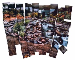
This collage is of a river/stream. It looks kind of small, and you would probably be able to walk across it because there are a ton of stones and rocks. Some of the photos in the collage are darker than others, so they might have been taken at different times is the day, or on different days altogether. The sky is not really in the picture because hills and mountains are covering them. You can see many trees lining the sides of the stream, as well on top of the mountains.
As I said previously, some of the photos are darker than others. Specifically, what little sky there is, and the water in the stream. This might suggest that the water is no good, or polluted. The sky could also be polluted from smog and other chemicals. The colors also are contrasting, giving it a dramatic feeling.
This photos demonstrates many different formal elements. The colors are contrasting and strong. The stream also creates a line for the eye to follow.